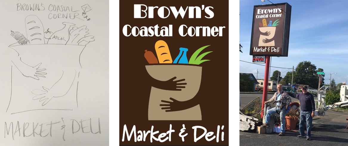
Simplicity. Readability. Branding.
- Simplicity. If your try to cram too many words and images onto your sign, it won’t be readable. In the case of the sign above, people in automobiles have just a few seconds to take in the sign. The words and imagery need to clearly and simply communicate or the sign will have failed in delivering a message.
- Readability: Lettering Size & Style. Understandably, business owners investing a lot of money into a sign want it to say and do a lot for them. Smart businesspeople pare things back as far as possible. Designers refer to readability charts that help us ensure the letter height is appropriate to the distance and time between the reader and the sign. Additionally, pay close attention that the fonts you use are easily readable. A lot of people under 20 years old today don’t know how to read cursive!
- Readability: Contrast. The lettering and graphics “pop” because of the tones of the colors used. Contrast plays a huge role in the readability of signage.
- Branding. Look at the sign above. Had we made the shopping bag white, and the background blue, would it have communicated the same message? Would it have been as memorable? We took advantage of the family name to further imprint the businesses’ brand through color.
It’s not easy to keep your message simple and direct but if you do, your sign will work hard for you!
P.S. Don’t forget to check with your city or governing authority to ensure your sign will be legal. Not doing so can be a very expensive mistake!
Props on this project to John Edwards of JD’s Signs, who created the sign from our life-size mockup, Roger Holeman and his scissor lift and installation assistance, and the Brown Family, who worked together from concept through installation.


