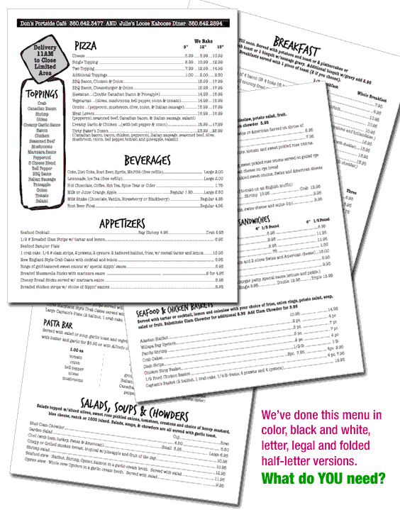
Menus usually pose the challenge of putting a lot of information into a comparatively small amount of space. Menus should be easy to read by all ages in mood lighting and most restaurant owners want to include a fair number of graphics and images, as well as use an interesting font or two. As a designer, I want to create lots of space for the eye to rest, and keep consistency of brand. The challenge compounds when a restaurateur needs to be able to edit the final product themselves, meaning I need to use a tool like Word instead of professional page layout software. It’s not always an easy puzzle, but it’s usually fun!
Don Shaw of Don’s Portside Cafe and the Loose Kaboose is easy to work with because he gives quite a bit of freedom to design once he dictates the page count and provides the text. By putting me in charge of more elements of the puzzle, Don saves money because we go through fewer revisions. His full-size menus came out very readable and engaging this year! The take-out menu is half the size of what you read in the restaurants, which makes it affordable to get it in the hands of the many visitors to our beach without losing integrity of design.

