Keith called on John Aylward after the “Great Coastal Gale of 2007.” John and his crew did an outstanding job of replacing the roofs on both our home and our office building. The home roof was composite…in a variety of layers and with five (yes, 5) different pitches. That is, before it all but disappeared in the storm. Our office had a cedar shake roof that was about half-obliterated. John took what was left of the shakes, and the shake structure, down and replaced it with a plywood base and composite tile. Nearly 3 years, and many good coastal storms, later, both are still perfect.
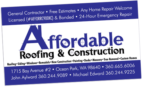
Recently taking on a partner and naming the company Affordable Roofing & Construction, John stopped by a couple of months ago and asked me to design a business card that could double as a logo. He knew he wanted to use the color blue and had a sketch of a letter ‘A’ turned into a house. No problem! I gave John a draftsman-like font and added a chimney to the A, using white for the main field color and blue stripes to give it color ‘pop’ and strength, while limiting the palette for less expensive reproduction. Once John and his partner had signed off on the art, I put it on a CD in multiple file formats so he could use the art with other vendors. Within weeks, I was seeing the look on trucks and signs all over the Peninsula, and hanging over their shop door in Ocean Park.
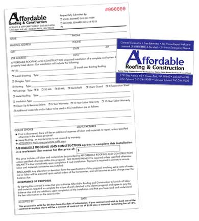
Most recently, I created a 2-part carbonless, consecutively numbered quote/work order form for the company. It’s gratifying when clients let me show them how they can save money by first brainstorming without thought of budget and then putting the parts together in a way that makes best use of their resources and in an order that makes sense. Because John told me about the variety of projects he had in mind before we started, that he had the time and inclination to work with vendors himself, and that he wanted to keep the cash flow as tight as possible, his art developed in a way that best leveraged his resources to meet his goals.
By letting one shop (ours) give him art for other vendors, he keeps his art production costs in check as multiple graphic designers aren’t starting from scratch.
By starting with a logo, and getting clear about its important elements (in this case, the font, colors and stripes), John was able to keep his brand consistent as he quickly moved through a variety of collateral projects. In other words, he got more bang for his buck because he was smart–not with deep pockets.
Way to brand on a budget, Affordable Roofing & Construction!
–Keleigh

